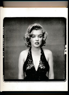
I love the speckled texture you go in the upper left hand corner. It gives the piece almost a vintage feel, something is aging. This would make sense too since you are including childhood photos of yourself. What would be your one word? I think growth might work but I am sure there are others as well.
The pink color should be a bit more saturated to avoid a "muddy" look. I struggle with that in my own art so I want to share that tip with you! The idea here is good, though. I see a split, if I'm correct. I wonder if you could emphasize that!
The pastels and dreamy vibes from the colors work really well in furthering your theme, it starts to feel dream-like, which makes sense and reflects the haziness of looking back on childhood. To reference the cycle idea, a way you could go is starting to sharpen the image when more recent photos are used and add more clarity
The split and color choices are interesting! Maybe bringing one part out more as a focal point could help with the flow of the piece and give it some more movement.
.jpg)
I love the speckled texture you go in the upper left hand corner. It gives the piece almost a vintage feel, something is aging. This would make sense too since you are including childhood photos of yourself. What would be your one word? I think growth might work but I am sure there are others as well.
ReplyDeletei agree i like the texutre but the images are a little bit hard to see. maybe play with the filters more
ReplyDeleteThe pink color should be a bit more saturated to avoid a "muddy" look. I struggle with that in my own art so I want to share that tip with you! The idea here is good, though. I see a split, if I'm correct. I wonder if you could emphasize that!
ReplyDeleteI like the split down the middle, I think it divided the piece nicely. I cant wait to see where this ends up
ReplyDeleteThe pastels and dreamy vibes from the colors work really well in furthering your theme, it starts to feel dream-like, which makes sense and reflects the haziness of looking back on childhood. To reference the cycle idea, a way you could go is starting to sharpen the image when more recent photos are used and add more clarity
ReplyDeleteThe split and color choices are interesting! Maybe bringing one part out more as a focal point could help with the flow of the piece and give it some more movement.
ReplyDelete